When Discomfort Is the Design: Safety Training for an Airline
January 1, 2017
The Problem
Every employee at a major Latin American airline carried a physical Green Card: a laminated checklist for responding to a bomb threat call. Most of them had no idea what it was, what it was for, or how to use it in a real situation. The card existed. The knowledge didn't.
Existing training hadn't closed that gap. It was long, linear, and treated the subject the way most compliance training does: as information to be delivered rather than a situation to be prepared for. Employees disengaged. Retention was poor. And the stakes of that failure, in the airline security context, were not abstract.
The brief was to fix the training. The real problem was getting people to take a real threat seriously before they ever faced one.
My Role
Lead Interaction Designer and Frontend Developer at StudioDeki, 2017.
I led the full design and production process: user research, narrative design, interaction design, visual design, and frontend development in HTML5, SASS, and JavaScript using the StudioDeki authoring system. Delivered in Spanish, English, and Brazilian Portuguese for a distributed workforce across airport operations, administrative offices, and leadership.
Constraints
- Sensitive subject matter in a difficult regional context. Bomb threats are not hypothetical in South America. The content carried real emotional weight, and the client was understandably cautious about how it was handled.
- Extreme audience diversity. The course had to work equally for CEOs, pilots, crew, administrative staff, and airport ground personnel. Same content, same standards, universally legible.
- 20 minutes maximum. The previous training was too long and lost people before the critical content landed. Everything had to fit inside 20 minutes without cutting learning objectives.
- Three languages, one interaction system. Spanish, English, and Brazilian Portuguese versions had to maintain consistent interaction behavior and visual hierarchy across layouts.
- SCORM certification as a hard deliverable. The course had to produce completion and assessment data compatible with the client's LMS infrastructure.
Design Decisions
Validate the uncomfortable choice before committing to it
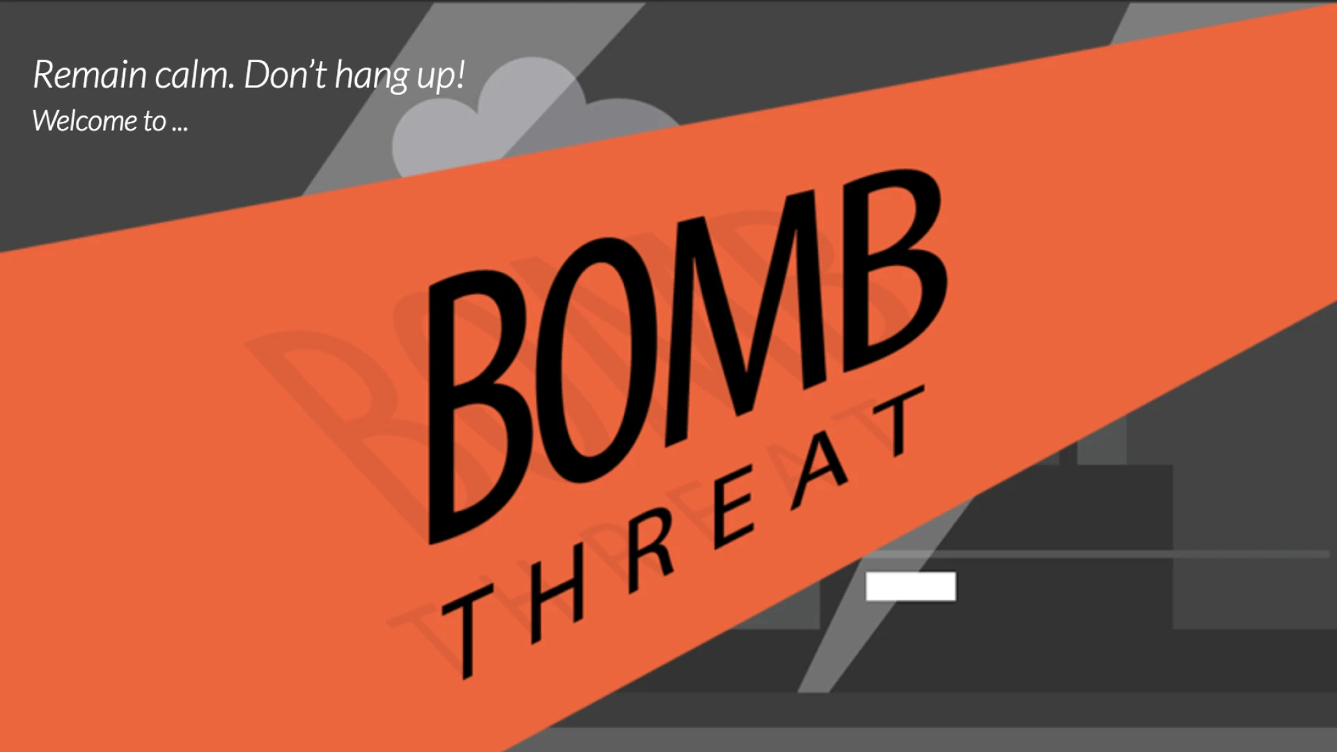
The core narrative proposal was to open the course with a simulated bomb threat phone call: no warning, no context, just the scenario starting. The intent was to create immediate emotional engagement and simulate the disorientation of a real event.
The client hesitated. The subject is sensitive. In the South American context, this kind of scenario is not distant or theoretical, and presenting it without testing felt irresponsible in both directions: too soft and it wouldn't work; too aggressive and it could backfire.
So before committing to the approach, an A/B test was run with a small group of participants. One group experienced the first five slides with the simulated call as the opening. The other experienced a traditional linear introduction. Both groups were evaluated on engagement, retention, and practical recall.
The results were clear. Participants who experienced the emotional, uncomfortable opening felt more engaged, retained more of the procedural content, and demonstrated stronger practical recall of how to use the Green Card. The discomfort was the point: it created the psychological state closest to what a real situation would feel like, which made the training transfer to real behavior more effectively.
The A/B result gave the client the evidence they needed to approve the approach. It also gave the design team confidence that the decision was grounded in user response, not aesthetic preference.
Design for the moment of use, not the moment of training
The Green Card is a physical object people carry and pull out under stress. The training had to be designed around that moment, not around the classroom or the screen. Every interaction, every scenario, every decision point in the course was mapped back to a specific action the employee would need to take in a real situation.
This meant resisting the instructional instinct to explain everything first. Instead of presenting the card's contents and then testing comprehension, the course put employees in the scenario and surfaced the card's logic through the experience of needing it. Understanding followed urgency, not the other way around.
Gamification in service of procedure, not engagement for its own sake
Decision points and scenario tasks were not added to make the course feel modern or interactive. Each one was mapped to a specific procedural step: what to say, what to record, what to do next. The game mechanics existed to force active recall of the correct sequence under pressure, not to reward participation.
This distinction matters. Gamification applied loosely produces courses that feel engaging but don't change behavior. Applied specifically to the procedure being trained, it produces courses where the interaction is the learning.
Localization as a design constraint, not a translation task
Three languages meant three content versions, but the interaction system, layout, and visual hierarchy had to hold across all of them. Text length variation between Spanish, English, and Brazilian Portuguese affects layout at the component level. This was addressed at the system level rather than per-screen, ensuring that no language version produced broken layouts or required manual adjustment per slide.
What I'd Do Differently
The A/B test covered the opening sequence but not the full course. A second validation round on the assessment and certification flow would have been worth doing. The completion data from the LMS gave aggregate numbers but not the granular behavioral signal that would have shown exactly where in the course people were consolidating knowledge versus going through the motions.
I'd also push harder today for a follow-up measurement: not just certification rates but observed behavior change in the months after training. 12,000 certified employees is a strong output metric. What it doesn't tell you is whether the training actually changed how people responded when a real or simulated threat occurred. That's the question the course was built to answer, and closing that loop would have made the case for this approach much stronger.
Outcome
- 12,000 employees certified across all roles: CEOs, managers, pilots, flight crew, and administrative and airport ground staff.
- Course delivered in Spanish, English, and Brazilian Portuguese, covering the airline's full operational footprint.
- Measurable increase in staff engagement and participation rates compared to previous compliance training formats.
- Positive qualitative feedback on the storytelling approach and the practical relevance of the interaction design.
- Completion achieved within the 20-minute target, meeting LMS reporting requirements across all platform deployments.
Transferable Insight
Design is not the visual. It is the structure, the narrative, and the sequence of decisions that move a person from one state of understanding to another. A compliance training course about a bomb threat card is not a different discipline from interaction design on a digital product. Both are about getting someone to the right action at the right moment with the least possible friction and the highest possible confidence.
The uncomfortable opening worked because it respected the user enough to put them in the real situation rather than protecting them from it. That is a design decision, not a content decision. And it transferred to behavior because the discomfort was purposeful: it activated the same emotional state the training was preparing people for. Design that only works when conditions are comfortable isn't designing for the actual use case.